

For many, iOS 7 is synonymous with problems, headaches, slowness…. But the truth is that we have to get used to the change in Apple since the time will come when we will have no other option if we want to continue enjoying the latest versions of our favorite applications, and many new ones that will only be compatible with the new iOS 7.
To make the change process more comfortable from Actualidad iPad os We want to teach how to squeeze all the possibilities of this new iOS and that the change is as comfortable for you. If a few days ago we brought you a post on how to get more out of the batteryToday we bring you 5 tricks that will greatly improve the experience with the new operating system for iDevices.
1. Increase the size of the text
Accessibility changes are always welcome, you do not necessarily have to have a vision problem or anything like that, but these changes will make our devices more accessible. In this case we will have a more comfortable reading by having the text in a larger font. In iOS 7 they have changed the font of the text and it probably could do with a little more size. If you go to Settings and then to General, you have an option called "Text size." Simply move the slider to change its size.

Also comment that applications that support "dynamic text sizes" will also be affected by this configuration.
2. Bold text
Another interesting accessibility feature is the possibility of convert iPad text font to bolda, so everything will be much more readable avoiding the "thinness" of the new iOS 7 font.
You can see the effect in the capture that heads the post. You have the setting in the Accessibility menu (under General), and then the option «Bold text» (it is necessary to restart the device when turning the setting on or off).
3. ON / OFF labels
Now the action switches (switchers) show their status by changing color, white for off and green for on. In previous iOS it would show an I to point on, and an O to point to off. The previous version may be more comfortable for you, with which you will also have the possibility of seeing the white / green colors depending on the status of the switch.

This is another Adjustment that you can find within the accessibility menu.
4. A flat wallpaper
We may really like an image, but it is true that choosing a good wallpaper for our iDevice it can be complicated, It has to be very consistent with the app's icons so that a strange noise is not formed due to saturation of elements. If you see the following screenshot you can understand this.

A flat bottom is quite flattering to the device, everything is quite clear and does not cause a distraction from elements. For what you we recommend using flat bottoms (those that come in iOS 7 are quite aesthetic) in your iDevices. While it is true that on the lock screen this matters less, although you also have to bear in mind that the clock now has a much finer font and can be confused with the Wallpaper.
5. Reduce the effects
And the "trick" that is becoming more "fashionable" is the one that disable new iOS 7 visual effects, for several reasons: it reduces the battery consumption, cause a visual aberration which causes us to not see the elements well (in some users), and makes our device work very slowed down.
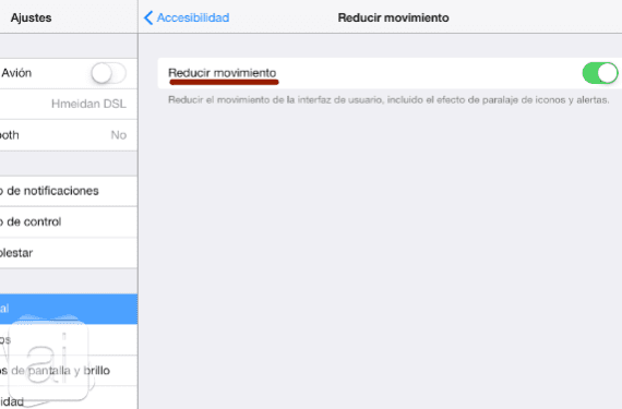
So if you want you can disable one of the most relevant "improvements" in iOS 7. The way to do it is inside the menu Accessibility, and then we have to enter «Reduce movement«.
We hope that the tricks that we have shown you are useful for you and we hope to continue contributing more of these.
More information - Optimize battery consumption in iOS 7
Karim, look at the aberration you wrote in section 5. Be careful! I do not mean that you have committed an aberration but the aberration that Apple has committed with iOS 7. You say…. "Makes our device run very slow." and then add ... «So if you want you can deactivate one of the most relevant" improvements "of iOS 7»
That is, one of the most relevant improvements in iOS 7 can make our device work very slow. Obviously you mean the most advanced devices since this improvement is not even present in the older ones. Come on, Apple has brought to light an OS that makes its most advanced devices (with the exception, I hope, of the 5S), work badly or with the well-known Android lag. This suggests that iOS 7 is a bad OS and very poorly optimized, which has NEVER happened in previous versions.
Yes you are right, although it is true that the biggest problem comes in old devices, and we already know that in the end everything comes from programmed obsolescence ... A shame on Apple's part but do not say it too loud that critics may come later!
If you have the SHSH, I know a shorter one, which solves all the aesthetic problems at once and increases the performance of the phone a lot:
1. Downgrade to iOS 6