The launch of Apple's new music service has not been without criticism. A somewhat complicated interface with endless menus and some too hidden options made many users complain that the procedure to add their favorite music to the Apple application was too complicated. A company that has always been known for making intuitive and user-friendly software could not allow this to happen, and Apple are working to modify the interface of the application for iOS, so that in the latest Beta of iOS 9 you can already see some changes that improve the usability of the application.
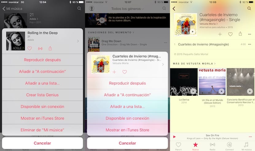
If you have iOS 8.4 installed on your devices, compare the images of your application with those of these captures. As you can see, the cover of the album or single in question is much larger, and they appear next to it buttons with functions that allow the displayed menu to be less extensive than in iOS 8. In addition, by pressing the cover or the right arrow we can access the album. The heart icon to mark a song as "I like" and thus help the suggestions made by Apple better adapt to your tastes, next to the wave icon to start a station based on that artist and then the button to share for that same, share it on social networks.
The menus are something that has also improved a lot in iOS. LThe buttons are larger and the list does not give the impression of being a phone book with an innumerable list of options that give an aspect that is not very adapted to what is usually the interface of any Apple application. Well, or rather, not just any Apple application, because iTunes unfortunately continues its endeavor to be Apple's most hated application, and there seems to be no sign of it changing in the short term.