
So far we have seen some concepts of iOS 11 in which the possible novelties of the new Apple operating system were shown. The truth is that little information we have of the new version of iOS, whose presentation will take place next Monday during the two hours of WWDC 2017 presentation keynote. Rumors and concepts emphasize new Siri functions, Dark mode and modifications in the Control Center, but nothing is official. After the jump you have all the information of a new concept of iOS 11, which so far is the most complete.
Common aspects with other concepts that are worthwhile
The truth is that throughout the almost 5 minutes of concept, we can see functions or changes that we have already seen in other concepts such as a possible dark mode, a kind of Split View for iPhone or user accounts for the iPad. These features may be fine but I don't know if they will convince all iOS users.
One of the aspects that I most want to see the Big Apple incorporate in iOS 11 are 3D Toggles in the Control Center, that is, integrate the 3D Touch to the current toggles to vitaminize them: select a Wi-Fi network from the springboard, deactivate mobile data without accessing Settings ... little things that make the quality of user use better.

Today Page: Siri Vitamin Suggestions
In iOS 10, when we slide the screen to the right we access a section where we can see our widgets, and the information they contain. This concept slightly transforms this section by adding Siri vitamin suggestions, in the sense that the wizard will offer us specific actions that we have been doing days ago such as activating alarms on Tuesdays at 20.00:XNUMX p.m., according to whatever time it is, offering us the possibility of listening to one playlist or another.
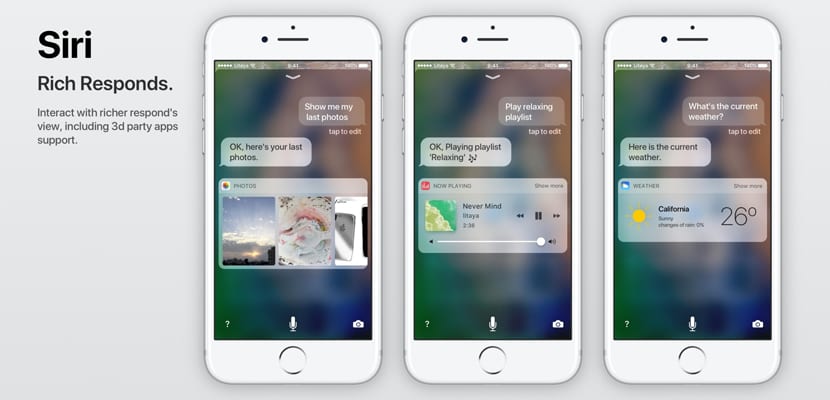
Siri returns to the load ... but does not convince
The iOS virtual assistant, Siri, needs to make a splash to counter the advances of the competition. But the changes seen in this concept they are not what I expect from iOS 11. The concept speaks of an integration with third-party applications but does not show us specific actions. On the other hand, it changes the design to the purest Apple Messages app style, a design that does not convince me to be Siri.

The iOS 11 Camera app with useful changes
Who has not taken a photograph with one hand? This is one of the things that I liked the most about the concept in which you see a redesign of the Camera application in which all parameters can be accessed with one hand only, in a simpler way to prevent our iPhone from being thrown when making maneuvers to reach the upper left corner with the thumb. I have also found interesting the possibility of change video quality without the need to access the iOS Settings.
Some ideas are fine, such as the multi-account which is something that has been called out since the first ipad came out, Split View for iPhone or the dark mode, even the 3D touch for the toggles and the camera, although I would prefer more That it had pro options like the LG app (G6 and V20) that if as they have raised the interface I do not like it in the least, I trust that the Apple designers will surprise with a beautiful redesign, they cannot be taken as a reference to material design and the skype app that have good designs because I think it is time for iOS to refresh and have a facelift, personally I love the very minimalist android interface, although the iOS interface is beautiful since it is outdated, It should be flatter, more minimalist, modern, fluid and more youthful with vibrant colors and fun animations, something that appeals to young audiences and gives iOS a touch of freshness and simplicity that if I like the control center such How is it done? ho should I remove the colorful toggles and turn them white as it was in iOS 9 or 7