![]()
The history of the Apple logo has been surrounded by many urban legends and stories, each one more original. Is about one of the best known brand images in the world. It will be strange that someone does not identify the apple of your iPhone or MacBook, it does not matter what country you are in.
Its changes have been very slight over time, perhaps that is why the rainbow apple logo is still fully in force despite the fact that the company long ago abandoned it for a monochrome image more in line with its current design lines. But what is the history of this rainbow logo? We tell you the one that we would like to be real but it is not, because it deserves it, and of course the one that is the authentic history of the multicolored Apple logo.
The most beautiful story, but false
The Apple logo was not always the one we all know. When the company was founded, it did so with an image that did not correspond to the ideas of Steve Jobs at all. In a tribute to Newton and his work on Gravity, Apple used a logo with the famous image of the scientist under an apple tree. How had Newton started his ideas about Gravity? Because an apple fell on his head, so nothing better than that image to represent Apple's apple.
![]()
It was too complicated a logo for Steve Jobs, who quickly wanted to find a replacement, and the logo of the multicolored bitten apple appeared. This is where our favorite story about the history of the Apple logo comes in, with a fully deserving protagonist of this honor: Alan Turing. Considered by many to be the forerunner of modern computing, including artificial intelligence, his work was essential for the victory against the Nazi army during World War II, as well as for the development of computing as we know it today. .
But all this was forgotten by the British government when in 1952 he was prosecuted for homosexuality and forced to receive a chemical castration treatment with hormones that produced important physical disorders, in addition to the rejection of the entire society of the time. Just two years later, in 1954, died after ingesting an apple poisoned with cyanide, according to official sources, voluntarily. This unfortunate suicide would be the reason why the Apple logo would be a bitten apple. To give history one more turn, many add that the multicolored bands are in honor of the homosexual community.
The real story, no romance
The Apple logo, the multi-colored bitten apple, was the brainchild of Ron Janoff, designer of the Regis McKenna company in 1977. According to the creator himself of the logo, Steve Jobs said absolutely nothing to him before creating the logo, no guidelines to follow or preconceptions. Being Apple the name of the company it seemed obvious that an apple could be the most appropriate image to identify its products. The problem is that an apple can look too much like another fruit, and if we make it small even a cherry, that's why he added the bite.
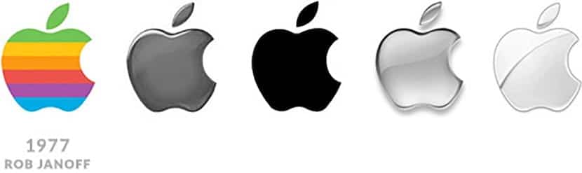
Much has been said about that bite, because in English it is said "bite", very similar to "byte", which is why many say that Janoff added that detail to the apple. But this, according to the designer himself admits, was a mere coincidence, it did not even cross his mind. And the multicolored bands? The explanation is very simpleThe Apple II was the first personal computer capable of displaying color on a monitor, hence making a multi-colored logo made all the sense in the world.
Surely many of you have already read this story many times, but after talking about this topic in the gum pomegranate I thought it was a fabulous idea so that those who did not know the first story, or for those who did not know the second, had knowledge of the real story of the Apple logo, and also of the accompanying legend.
I am a designer and the fact that he added the bite so that it would not look like another fruit is a very cheap excuse. Since it can still look like a peach, a mango, a nectarine or who knows what. And the same thing about colors, nothing simple, let's see what colors and how many and the mother. Designing a corporate image is one of the longest and most complex jobs out there. There are 1000 laps and each thing is meticulously studied. As Janoff explains, it seems like it was done in 5 minutes, and not at all. And that Steve Jobs did not put his hand in that logo nobody believes it.