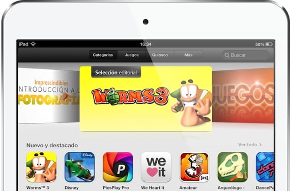
The design of the applications is essential for a user to have good impression from the same. Of course, let's not leave aside the app's own tools: if an application does not fulfill the objective we seek, it will not serve us. But it is very important that you feel good. We can see the importance of design every year at Apple's annual developer conference: the Worldwide Developers Conference (WWDC) where are some reserved? Awards for the best designs in the entire App Store. It is a session where developers can show off their ases up the sleeve, checking that a good design can attract a greater number of downloads, as long as the objective is more than met.

Mountain Valley is one of the best-designed games ever
If Apple considers it important, it will be for a reason
It is obvious that before an application becomes part of the App Store it has to pass a series of "filters" and criteria that guarantee quality and stability on all devices where it can be downloaded. One of those filters is in the application design.
I do not only refer to the structure and distribution of internal elements of the application when I refer to the design. But to the color range used, the type of structure used, the app logo and above all, the Minimalism which Apple has advocated for a couple of updates.
Let's put it into practice on the App Store. Let's imagine that we are looking for an app that informs us of all the Madrid bus system. We do a search in the store and we get three completely different apps:
If we analyze the logoFirst of all, we see that EMT Madrid has a very simple logo but it is pleasing to the naked eye compared to, for example, Madrid MBC which has a gray gradient and three central elements of different colors that do not sit well on the eye.
Important: I make a small note to inform you that these types of judgments are totally subjective. But, objectively, it can be deduced through design criteria which ones best fit the trend towards minimalism within the App Store.
Second, the own application design. In this case, EMT Madrid and Madrid Bus EMT Interurbanos are quite similar, while Madrid MBC has a design that breaks with the trend towards minimalism shown by iOS 10.

Let's not get obsessed either: design isn't everything
As I have pointed out before, design is important, but it is not everything. On many occasions, we will have to use horrible applications that meet our needs. In these cases where there is only one app that has a certain function, the functionalities of the app will prevail over its design.
But if we analyze a general judgment, the developers take into account all these factors that we have analyzed far above. They are aware that users are very critical and seek perfection. Do you prefer apps that are poorly designed and functional or with great designs and functional deficiencies?
Image - Tympanus
