
The arrival of iPhone 5S in gold color is opening a new debate on the net. It is the first time that Apple dares with this color for its smartphone and analyzing the comments, there are diversity of opinions about this color. On the one hand we have those who find it very elegant and different while on the other, there are those who think that a gold iPhone is tacky. As always, there are colors for tastes.
A couple of days ago, TechCrunch claimed that the existence of the gold iPhone 5S is realWe have even seen a case with great detail. Those who have already seen it tell us that more than a golden color, the tone is more similar to that of champagne and also, its intensity varies a lot depending on how the light falls on the surface.
Below you have a comparison in which you can see this gold colored housing compared to white (aluminum combined with white) and current black:

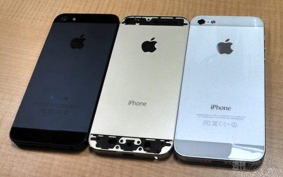
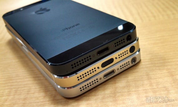
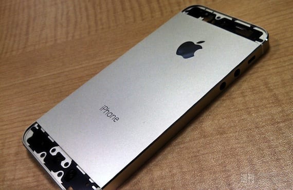
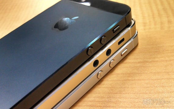
In this gallery of photographs you can see that the golden hue that Apple has applied it's very subtle And it is true that the intensity of the color varies a lot depending on how the light falls.
The detractors of the iPhone 5S in gold color, do you still think that it is an ugly terminal or your opinion has changed after seeing the comparison? In my case, in the absence of seeing it live, it seems to me a quite striking color although I still need to know what color the front and the glass pieces that go in the upper and lower part of the screen will be.
More information - More sources confirm that the iPhone 5S will also be gold
Source - 9to5Mac
Ortera. Oriented to the Chinese market where everything is cheap and "ugly" is cool ...
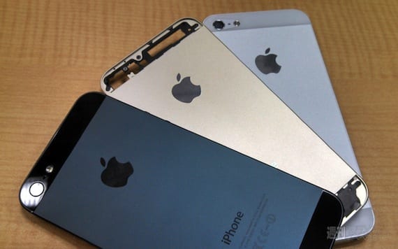
This is the gold iPhone 5S compared to the black and "silver" version
Read more: This is the gold iPhone 5S compared to the black and white version https://www.actualidadiphone.com/2013/08/22/asi-es-el-iphone-5s-dorado-comparado-con-la-version-negra-y-blanca/#VzQ12SUfdVp1nVF3
Get Links to your Contents in http://www.intentshare.com
In ios 7 the initial screen is white for the white iphones with black apple and the black ones in reverse…. I can't imagine a startscreen with a «golden» apple haahaha
If this is the color, it doesn't have much of "gold" ... It's more of a "champagne color", and I don't see it as ugly. Only it is something «strange» to see an iPhone like this ... Pa´ tastes ...
Something tacky is when that something does not hit, or is very striking; in short something vulgar and ordinary. Tacky it would be if it were yellow chicken, for example.
That said, I do not find this color tacky at all, it is very fine and follows the tone and color balance of graphite and silver.
I like gold and silver! I love design and gold and tacky are linked to my life .. lol… GOLD is great! although the design of the iPhone is tired ... they should modernize it yaaaa!
hahaha thousands of colors all so that they end up putting a cover on it so it does not scratch them hahaha damn marketing