
Since the release of iOS 7, many of you complain about a deterioration in the performance of your device since you updated. Faced with this problem, my answer is always restore device from scratch, without updating via OTA or through iTunes, or using the backup. But it is also true that iOS 7 is a more demanding operating system than the previous ones, and the transparency and Parallax effect consume a lot of resources, which affects the performance and battery of your device. Luckily, Apple has included the ability to disable them.
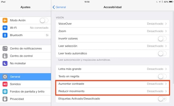
For this we must go to Settings> General> Accessibility and activate the options «Increase contrast» and «Reduce movement», which are disabled by default. With this, we will eliminate those effects, which some users are complaining about causing dizziness and dizziness after prolonged use of the iPad or iPhone. What cannot be disabled is the "Zoom" effect when unlocking the device or when opening or closing applications.

Obviously the visual change is great, as we can see in the screenshots. The upper image corresponds to an iPad with the effects activated, and the lower one with the effects deactivated. Although it is not very noticeable in the dock, the change in the Control Center is very noticeable. But they are still purely aesthetic issues and many of you may you prefer an improvement in the performance of the device before a springboard "more beautiful".
By the way, If you have an iPad 2, your Control Center will be opaque, grayish in color. This device does not have the option to activate transparencies, so do not look in your system settings for the way to do it. In theory this is because this device does not have enough power, something very questionable, since the iPad Mini does have these effects, and the performance is good.
More information - Prepare your device to update to iOS 7 (I): Update or restore?
Parallax and dynamic backgrounds can but are you sure that simple transparencies cause a worse performance? I do not believe it, these transparencies can be made with a more or less transparent .png image and let's not forget that Apple uses .png images for practically everything so I suppose it will be exactly the same here. Since the size of the image (which is the background) is always the same both in the notification center and in the control center, the simplest, easiest and possibly recommended thing is that it always be the same image. Come on, this would have absolutely nothing to do with performance.
By the way, in the dock depending on the background it shows and a lot if it has adequate transparency or not. But tell those like me who have an iPhone 4. The control center with that nuclear gray is absolutely horrible. Nothing to do with the effect on an iPhone 5, but nothing to do. And as I say I am totally sure that it is not for performance reasons, but rather to encourage the purchase. In the iPhone 4 I have had the BlurriedNCBackground and I have never had any performance problems because of it, ever.
I don't know if you've noticed but the layers with transparency are not just transparent png images; In addition to that, there is a blurring of the background elements, be it icons, text, a game or the wallpaper itself. With which it is assumed that it is not something as simple as a png placed there, and logically it follows that the effect is achieved by means of a script that creates an image out of focus or directly out of focus under the transparent layer ... And that by force consumes resources. As a plus, it also makes a calculation of the color, the tone and the percentage of black (or something like that) and according to that it shows some items of one color or another (white or black) ... Come on, there is a lot of pijadita.
In versions prior to 7.1, when the transparency effect was removed, at least, the "Dock" more or less adopted the color of the background image; but in version 7.1, it does not adopt the color of any background image, and makes it look horrible with any background that is not grayish.
My question is if you can make the Dock, when you activate "reduce transparency", at least adopt the color of the image; as it did in previous versions.